MOTION GRAPHIC AND COMPOSITING - PROJECT 3
01.06.20 - 22.06.20 (Week 9 - Week 12)
Helen Angelia (0336203)
Motion Graphics and Compositing
Project 3 - Channel Identity
Module Information Booklet (MIB)
Week 9
For our third project, Mr. Fauzi gave us a briefing of what we should prepare to present in the next class. We needed to prepared 4 mood boards, 6 boxes of storyboards, 5 seconds of animatics, and 2 samples of audio.
Since channel ident is some kind of continuous to the previous project, I decided to make the content of Twice Upon A Book brand. Since some parts of my last storyboard were actually for the third project, I now can include them in this project. Here is my first attempt for the storyboard:
First Attempt Channel Ident Storyboard
I presented my presentation slides along with the storyboard and the requirements needed for the project to Mr. Fauzi. The lecturer said he likes my presentation as it is very detailed and I assumed he understands what I was planning to do. However, he told me that I should remove the hard parts, like animating people drawn in the storyboard, because it would be time-consuming. He kind of worried if I will have enough time to illustrate and animate all of my works since there was a lot to do.
He then suggested me to make a timetable for myself in organizing my work, so I wouldn't be stressed out by the number of things to do and focus on the call for actions. I should simplify the storylines and for now only focus on scene 1 and scene 4 (6 pages of storyboards). Also, I would show him my animatic for the idea execution in the next class.
Week 10
This week, Mr. Fauzi showed us motion tracking to help us if we have any character movements, especially in my case, because I might have people working around or doing kinds of stuff.
I showed the lecturer my rough animatic which I did not render because it was just to test out of how the animation would be made. Since the animatic was still rough, it was going on too fast that audiences could not enjoy the transitions of the scenes. If the animation takes too long, I might have to reconsider to delete some scenes.
I then tried to revise and make 20 secs of animatic and showed it again to Mr. Fauzi. Now he could see what I wanted to do with my channel identity. He suggested me when the door of the store opens, I should put fantasy scenes (nature and fantasy storyboard) in between before going to desk/home scene since there will be an extra of 10 seconds.
The concept is "open", the book opens, the shop door opens, the castle door opens, so it was like opening the minds of audiences. Mr. Fauzi said I can put the closing book part from the channel bumper for the ending scene. But of course, all of these should be tried first and see. Will it look nice? Will the audience be able to enjoy the animation?
Week 11
Here are my first attempt on illustrating the channel ident:
First Attempt Channel Ident Illustration
Mr. Fauzi commented that my color palette was too strong and contrast. He likes how I do the placement and all, but he wants me to make the colors more subtle and soft to match with the channel bumper one. Some scenes also still needed to be revised. The previous project was simple and minimalistic while channel identity has become more detailed and complicated.
The lecturer mentioned he could not really help me in suggesting what to do about the color palette, illustrations, and stuff, because my project is animation-motion graphics and he was not too familiar in that field. One thing for sure, I should simplify more of my storyboard, cut the last two scenes of payment and shipping and change the "add to shopping cart" to "purchase" and the next scene would be about "thank you for your purchase".
Channel Bumper Color Palette Reference
Second Attempt Channel Ident Illustration
I tried to change the color palette based on channel bumper and use the color as a reference from there. When I look at it, it does give a more consistent color and I kind of like this one more than the first attempt.
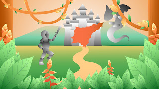
Mr. Fauzi said the leaves of the Jungle scene and Castle scene should be scaled and make it more forestry vibe. The dragon also looks a cute and fluffy one, instead of a fierce creature. Mr. Fauzi wants me to make the Jungle and Castle scene into more like a theatre kind of show.
So, the required finalized scenes would be:
- Bookstore
- Jungle
- Jungle and Castle
- Room
- Website page 1
- Website Page 2
Here is the final slide of the channel ident presentation:
Week 12
I showed Mr. Fauzi the final animation and he said that for the ending part, I should put the logo on top of the book to identify the brand Twice Upon A Book. I then input the logo and played around with opacity. I intentionally set the logo visible even when the background starts dispersing. I wanted to focus the sight of audiences to the brand as a final touch.
Here is my final outcome of channel identity animation:
REFLECTIONS


Comments
Post a Comment