INFORMATION DESIGN - EXERCISES

07.01.19 - 02.02.19 (Week 1 - Week 4)
Helen Angelia
Information Design
Exercises
LECTURES
Lecture 1 : Infographic and After Effects Basic
07.01.19 (Week 1)
Infographic
- Convert all research into visually appealing.
- The audiences will need to understand the messages.
- Create video / motion to make it more appealing.
After we understand the big outline of what infographic is, we were told to do After Effects exercise as a warm-up before we move to the next one.
We were told to choose a simple topic and animate them in After Effects. I chose my "Food" as my topic: "How to Make Simple Pizza".

Fig 1.1
Converting from Adobe Illustrator to Adobe Photoshop
Pepperoni Pizza

Fig 1.2
Converting from Adobe Illustrator to Adobe Photoshop
Veggie Pizza

Fig 1.3
Final Outcome of "How to Make A Simple Pizza"
After this, I animate the pizzas at Adobe After Effects and use Adobe Media Encoder to convert the files into mp4.
Here is the link for my Youtube channel:
Lecture 2 : History of Infographic
08.01.19 (Week 1)
For today's lesson, we were taught about the history of infographic from the 15th century to 21st century.
Hundreds of years ago, people still don't have internets. They have difficulties with gathering informations and all that. And on 1500, the people only think about survivals or we called them cavemen. Cavemen couldn't read at the time, so it was really hard for them to gain knowledges.
The cavemen were then started the "drawings on the wall" to documenting their lives. These drawings were usually animals painting. This was for the younger generations to keep living and avoid extinction. The cavemen kept the painting simple, as in fast and efficient ones.
The paintings soon improved into "Phonetic Alphabet". Phonetic means more to sounds rather than the alphabet themselves. We can find Phonetic Alphabet on Vietnam's Roman Alphabet.
When the people already knows alphabet, designs were slowly coming up to the surface. But at first, there weren't many people who were interested in it. It could because gathering information was still hard at the time. Also for other country, like England, they were maybe still attached to nobilities and religious things.
On 1600's, there were signs of technology improvements.
On 1800's and 1900's, there were steam engines.
Designs were almost popular back then when technology has improved. There were newspapers or any other medias to inform the public about things. But, in 1900's to 2000's, designs were then out of luck because of the world war.
And in this time, mapping was made. In war, a leader needs mapping to make strategies and lead the armies to victories. And to make this happened, they need people who can make readable maps. They had to sacrifice details so that people who read it won't get confused.
Designs were then started to rise again on the 21st century. Designers are starting modifies the icons and everything for accommodate lifestyle.
________________________________________
After the lecture, we were told to count buttons, differentiate them between sizes and textures, made information data about it and submit it to Google Classroom along with the picture of the buttons.


Fig 1.4
My Information Data
Blue Buttons
We need to make a poster of the 5 colored-buttons and beside my buttons, I was using my group mates buttons as well.


Fig 1.5
Chiquita's Information Data
White / Translucent Buttons


Fig 1.6
Feryn's Information Data
Black Buttons

Fig 1.7
Chelin's Information Data
Pink Buttons


Fig 1.8
Crystal's Information Data
Green Buttons
I combined all my data and my group mates's and come out with a poster for the buttons.

Fig 1.9
Final Outcome of Buttons Poster
Lecture 3 : Manuel Lima's 9 Directives Manifesto
09.01.19 (Week 1)
We were told to make slides and have presentation about Manuel Lima's 9 Directives Manifesto.
The result of our presentations wasn't so good. The slides are fine, but how me and my group presented it was unorganised and unprepared. Mr. Kannan was upset about it and told us not to do it like this next time.
Dynamic Numbers After Effects Exercise
14.01.19 (Week 2)
For this exercise, we were taught how to make dynamic numbers or when the numbers could increase or decrease itself.
I took some notes of how to do it:
Keyframe Part
- Keyframe >> value >> set the numbers.
- Effect
- Layer >> solid.
- Text >> numbers >> choose fonts and colours.
- Set the decimal numbers from 0,000 to 0.
- Set the value and keyframe.
- Set the size of the text.
Scripting Part
- Create a very simple rectangle (make sure there's no stroke).
- Transformation
- Drag the scale whip to value (100 number).
- Change the [temp, temp] to [100, temp] by double clicking scale.
- Layer >> Text.
- Whip of source text >> drag to value.
- Adjust the placement of the anchor point.

Fig 2.0
Screenshot of Dynamic Numbers Practice
After learning how to do it, we were told to make a simple animation with simple topic. I chose to do the comparison of the population of Indonesia vs Malaysia.
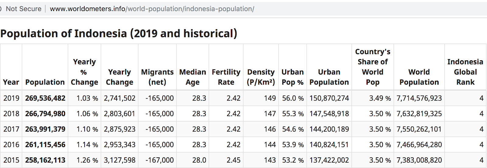
Fig 2.1
Population of Indonesia 2015 - 2018

Fig 2.2
Population of Malaysia 2015-2018

Fig 2.3
Screenshot of the Process in Photoshop
--------------------------------------------------------------------------------------------------------------------------
This is the link to my final outcome of the exercise.
--------------------------------------------------------------------------------------------------------------------------
Lecture 4 : Saul Wurman's L.A.T.C.H
15.01.19 (Week 2)
This was our second presentation. We were told to make slides and have presentation about Saul Wurman's L.A.T.C.H.
For this presentation, it went well. Mr. Kannan said we improved very well and with Ms. Anis, they said we've done a good job.
Pokemon L.A.T.C.H Exercise
14.01.19 - 29.01.19 (Week 2 - Week 4)
After presenting about Saul Wurman's L.A.T.C.H, we were given a task about making Pokemon based on the L.A.T.C.H itself: Location, Alphabet, Time, Category and Hierarchy.


Fig 2.4
Pokemon Elements


Fig 2.5
Electric Pokemon


Fig 2.6
Fairy Pokemon


Fig 2.7
Fire Pokemon


Fig 2.8
Water Pokemon
After choosing the Pokemon, we made the map for the Pokemon next. For the map, I wanted to do a little bit of isometric design.

Fig 2.9
Pokemon Map
After this, I combined all of them and make an animation is Adobe After Effects. But I needed and intro, so I put these in the exercise.


Fig 3.0
Pokemon and Pokemon Ball
--------------------------------------------------------------------------------------------------------------------------
This is the link to my final outcome of the exercise:
--------------------------------------------------------------------------------------------------------------------------


Comments
Post a Comment