DESIGN PRINCIPLES - EXERCISES

28.08.18 - 27.09.18
Helen Angelia (0336203)
Design Principles
Exercises
LECTURES
Lecture 1 : Cannot attend due to the lateness of arrival or visa matters.
28.08.18 - 30.08.18(Week 1)
Lecture 2 : Cannot attend due to the lateness of arrival or visa matters.
04.09.18 - 06.09.18 (Week 2)
Lecture 3 : -
11.09.18 (Public Holiday)
13.09.18 (Week 3)
Ma'am Sherry gave me lecture about contrast and gave me contrast assignment for first task.
Lecture 4 : Pattern, Repetition, Texture and Surface
18.09.18 - 20.09.18 (Week 4)
On Tuesday, there was presentation and ma'am Sherry gave us a bit of lecture about it also gave us a task to do.
On Thursday, we were supposed to do the patterns assignment, but we didn't and haven't worked on the patterns at all. Ma'am Sherry lets us do the symmetry and also feedbacks to those who have done their tasks.
Lecture 5 : Alignment, Hierarchy, Placement and Direction
25.09.18 - 27.09.18 (Week 5)
On Tuesday, there was no lecture, but Ma'am Sherry asked us to be in pairs or three to discuss each other's pattern assignments. After that, we were told to sketched everything that inspires us in this school.
On Thursday, Ma'am Sherry asked us to bring materials such as magazines or newspapers or anything that we could cut out and make collage.
Lecture 6 : Dots, Lines, Sizes and Scales
02.10.18 - 04.10.18 (Week 6)
On Tuesday, we were doing some critique and feedbacks about the collage. Then, we were having lectures about dots, lines, sizes and scales.
On Thursday, we were told to sketch shoes based on where we sit. After that, Ma'am Sherry called us one by one to do a private talk with several students outside the class about the blog.
Lecture 7 : Harmony, Movement and Rhythm
09.10.2018 - 11.10.18 (Week 7)
On Tuesday, we were talking about new tasks : harmony, movement and rhythm. We were told to do some photographs for this task. No need to use just one photo but nothing on the computer. Print them out and collage them or whatever we want to do with it, because we will be able to use computer programs soon.
On Thursday, Ma'am Sherry brought us to Ilham Gallery. We were brought there with the intention to understand arts and expand our knowledges about it.
Lecture 8 : Shape/Form and Figure/Ground
16.10.18 - 18.10.18 (Week 8)
On Tuesday, we were having critiques or feedbacks about our photographs and figure out what to do about the next task.
On Thursday, there was another presentation about shape/form and figure/ground.
Lecture 9 : Proportion, Proximity, Perspective and Unity/Variety
23.10.18 - 25.10.18 (Week 9)
On Tuesday, we were having critiques about our projects.
On Thursday, there was lecture about proportion, proximity, perspective and unity/variety.
CONTRAST
Contrast is an arrangement of opposite elements (light vs dark colours, rough vs smooth textures, large vs small shapes, etc.) in a piece so as to create visual interest, excitement and drama.


Black and white contrasts are a bit tricky. I need to find out how to make a drawing that can pop-up and make the people interested in seeing it. The assignment that was given to me may use the elements of pencils or black markers. I didn't have a marker at that time, so I used pencil instead.

Fig 1.1
Sketch of Black and White Contrast

Fig 1.2
Begin Coloring of Black and White Contrast

Fig 1.3
Finished Drawing of Black and White Contrast
------------------------------------------------------------------------------------------------------------------------------------------------------
GESTALT
Gestalt is a psychology term which means "unified whole". It refers to theories of visual perception developed by German psychologists in the 1920s. These theories attempt to describe how people tend to organize visual elements into groups or unified wholes when certain principles are applied. These principles are:
Similarity
Similarity occurs when objects look similar to one another. People often perceive them as a group or pattern.
Continuation
Continuation occurs when the eye is compelled to move through one object and continue to another object.
Closure
Closure occurs when an object is incomplete or a space is not completely enclosed. If enough of the shape is indicated, people percieve the whole by filling in the missing infomation.
Proximity
Proximity occurs when elements are placed close together. They tend to be perceived as a group.


For this exercise, I chose to make 3 kinds of forms or shapes to make a gestalt.

My Gestalt Final Outcome
The Lovebirds
The two swans being a closure makes a heart in the middle when their heads touch each other. And their wings are formed by leaves.
_________________________________________________________________________________
SYMMETRY, ASYMMETRY, BALANCE AND DOMINANCE
Symmetry is when a balanced composition feels right. It feels stable and aesthetically pleasing. It could look beautiful but could also look dull because it is more to passive.
There are three types of symmetry:
- Reflectional = all elements are mirrored.
- Rotational = as long as there is common centre.
- Translational = when elements repeated and placed on other places.


Asymmetry is when its elements might be focal points and attract your eyes, no one area of the composition draws your eye so much that you can't see the other areas. Asymmetry is more active, draws more audience, and could also be the freedom of expression. However, it is more difficult to make than symmetry.

Balance
Balancing a composition involves arranging both positives and negatives space in such a way that no one area of the design overpowers other areas. Everything works together and fits together in a seamless whole.

Dominance
The individual parts contribute to their sum but don't try to become the sum.

_________________________________________________________________________________
For the symmetry, asymmetry, balance and dominance task, I choose symmetry: reflectional.

Fig 1.4
Draft of My Reflectional Symmetry

Fig 1.5
Finished Reflectional Symmetry
--------------------------------------------------------------------------------------------------------------------------
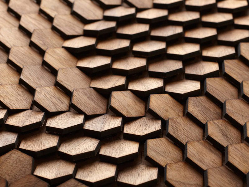
PATTERN, REPETITION, TEXTURE AND SURFACE
Pattern
The repetition of any thing -shapes, lines, or colors - also called a motif, in a design; as such it is one of the principles of design.
There are 4 types of patterns:
- Flow : Follow the paths
- Branching : Geological formations
- Spiral
- Packing and Cracking


Repetition
Repetition occurs when we use the same visual element or effect over and over or repeating single element many times (used more than once).


Texture
The surface quality of a two-dimensional shape or three-dimensional volume is called texture. Texture engages our sense of touch as well as our vision. It can enhance visual surface and conceptual meaning to a design.


Surface
Uppermost layer of a physical object/shape.

--------------------------------------------------------------------------------------------------------------------------
For the pattern, repetition, texture, and surface task, I choose pattern.

Fig 1.6
To start, I picked up leaves from trees and paint them with watercolour.

Fig 1.7
After that, I pressed the leaves with my hands so that the colour from the paint will look nice on the paper.

Fig 1.8
To make the pattern looked more natural, this is why I placed the roses after the leaves. We can colour the leaves in various colours to make it less boring.

Fig 1.9
Final attempt of my pattern.
_______________________________________________________________________________________________
ALIGNMENT, HIERARCHY, PLACEMENT AND DIRECTION
Alignment
Alignment is an arrangement of visual elements.
Types of Alignment:
- Edge Alignment: Determines the arrangement in relation to the edges of the page / canvas.
- Centre Alignment : Elements are aligned to the centre and more to formal occasion.
- Visual / Optical Alignment : Fixes some of the problems that can occur with other types of alignment due to the varying of letters and graphics. This can be helpful if we want to make one element stands out.
- Horizontal Alignment
- Vertical Alignment


Hierarchy
Refers to the arrangement elements in a way that implies importance.
Types of Hierarchy:
- Scale
- Color and Contrast
- White Space
- Proximity


Placement
The change and position of shapes that can affect visual depth and composition of an artwork.


Visual Direction
Leading eyes to the next direction.
Types of Direction:
- Vertical Direction : adds a sense of formality, alertness and balance.
- Horizontal Direction : calm and stable.
- Diagonal Direction : suggests movements and actions.


--------------------------------------------------------------------------------------------------------------------------

Fig 1.10
My Edge Alignment
--------------------------------------------------------------------------------------------------------------------------
DOT, LINE, SIZE AND SCALE
Dot
- Smallest and most base element of design.
- Dots are the building blocks of every design, as well.
- It is the focal points of composition.
- Single point in the centre represents calmness.
- Single point in the edge represents tension.
- 2 dots imply a structure.
- Repetition of dots make textures.
- Overlapping dots creates figures / relationship.


Line
- Image or artwork that creates straight lines and curve lines.
- There are straight lines (depth), 3D effects and curved lines (textures).


Size
- How big or small an element is in relation to other object.
- Used to convey important things, attract attention and make contrast.


Scale
- Refers to the size of an object (a whole) in relationship to another object (another whole).
- Creates emphasis, drama and hierarchy.
- Makes sense of design and images.


--------------------------------------------------------------------------------------------------------------------------
What I choose for this assignment is lines.

Fig 2.1
Unfinished Wolf

Fig 2.2
The Line Art of the Mouth and Nose Part

Fig 2.3
Part of the face has many short lines.

Fig 2.4
For the cheek, the fur was made a little bit longer than the other fur.

Fig 2.5
Since the fur of the wolf always changed, I made the lines for the body fur a little bit abstract.

Fig 2.6
The purple galaxy represents loneliness of the wolf, but there will always be light that guides its ways.
____________________________________________________________________________________________________
Harmony
- Means sameness.
- There are two types of harmony:
- Visual : artwork unified by colour, shape, composition or some others.
- Conceptual : artwork with common theme or concept.
- There are ways to achieve harmony:
- Repetition of colour, texture, shape and form.
- Repetition and rhythm.
- Unity and variety (directions).


Movement
- Path of viewer's eyes.
- Action creates life and activity (For example: ball bouncing).
- Some of the movements:
- Fuzzy outlines
- Multiple images
- Anticipated Movements
- Movement in repetition and rhythm:
- Repetition tend to tie things one another and make movement. (For example : Vincent Van Gogh's painting, Starry Night).


Rhythm
- Regular elements are similar in size and length.
- Progressive gradual increase of some elements required.
- Alternating two motifs or more that are alternated creating overall picture.
- Alternating elements not necessarily the same or identical, but similar.
- Random similar motifs repeated, but not consistency. Final piece could still be seen as a whole.


_________________________________________________________________________________

Fig 2.7
This picture has rhythm in it and we can see it from the sun that shone the glasses of the buildings. I took this picture when I was on my home from the gallery by LRT. After I woke up from my sleep and saw this beautiful scenery, I knew I have to take a picture of it. I really like the architectural of the building because it looks modern and made me amazed. Now this picture will be forever known and be my photography portfolio.

Fig 2.8
I took this picture when I was going to church at Sunday morning. This picture has harmony, movement and rhythm in it: the road blockers, cars and the yellow road paint. I took this picture because it represents Malaysia and the daily life we live in.
SHAPE/FORM AND FIGURE/GROUND
SHAPE/FORM
Shape + Form = Space
Shapes
- Brains attempt at resolving an object.
- Objects recognisable is realistic / neurealistic.
- Circle, square, triangle and rectangle are the main geometric shapes.
- Shapes are more to 2D.


- Objective : abstracted from real objects.
- Non-objective : pure study of line and forms.


Forms
- Forms are more to 3D.
- There are dimension, volume, texture, space, lines, and tones or colors.
- Forms are ever changing depending on philosopher.
- Shapes, idea or essence indicating characteristics how we see them.
FIGURE/GROUND
Figure : Foreground
Ground : Background
- There are blur, size and contrast which can distinguish between figure and ground.
- Types: stable, reversible (positive and negative energy attracts our attention and ambiguous (abstract).
- Gestalt Laws : area, closer, proximity, symmetry and continuity.


--------------------------------------------------------------------------------------------------------------------------
For the shape/form and figure/ground assignment, I chose to make shape/form.
These are the pictures that I used for my references of shape/form.


I told Ma'am Sherry that I wanted to make something outside my comfort zone. I've tried many things for the past weeks and I noticed that my art style was still the same as when I was in high school. I wanted to do more, I need to improve. Then I was inspired by a digital painting in youtube of drawing bubbles and perhaps fish (?)
The shape/form has one type that shows sizes, and sizes shows hierarchy. They are elements of design principle so I could use that. It was my first time making bubbles and fish, also drawing on black papers. It was quite a challenge for me.

Fig 2.9
Bubbles and Koki Fish
_________________________________________________________________________________
PROPORTION, PERSPECTIVE, PROXIMITY AND UNITY/VARIETY
PROPORTION
- Harmony between 2 or more elements.
- Creates harmony and unity.
- Good proportion adds harmony and symmetry.
- People responded emotionally.


PERSPECTIVE
- Represent 3D objects on a 2D surface to look natural and realistic.
- There are one point perspective, two points perspective and three points perspective.


PROXIMITY
- Create connections.
- Dispel connections.
- Moving elements closer together of further apart.
- Make design more comprehensible.
- Organise information.
- Relationship or lack of relationship between shapes.


UNITY/VARIETY
- Unity creates sense of harmony.
- Variety adds interest by contrasting elements.
- There are simplicity, repetition and proximity in unity/variety.
- Variety also embraces diversity.


--------------------------------------------------------------------------------------------------------------------------
For this exercise, I chose to combine two of design principles elements, which is perspective and proportion.

Fig 3.0
My Drawing Preference
First of all, I tried to find some preferences for my assignment.

Fig 3.1
My Drawing Sketch
Then, I sketch them all out.

Fig 3.2
Coloured Drawing with Classic Pencil Colour
After done sketching, I chose not to line my sketch with drawing. But instead, I coloured it directly with classic pencil colour.

Fig 3.3
Adding Single Colour to the Edge of Pedestrian Walkway
Since it was classic pencil colour, I need to be careful in colouring to get the details comes out from the stroke of the pencils.

Fig 3.4
Adding Shades to the Edge of Pedestrian Walkway
Not only colouring with just one colour, I add darker colours on the edges to make the colouring more lively.

Fig 3.5
Close Up to the Shades
I shouldn't make the shades too obvious, for it will ruin the drawing.

Fig 3.6
Adding Shades to Fences
Next was coloured the fence with silver grey. It's actually a white fence, but there should be grey for the shades as well.

Fig 3.7
Watercolour Background
And this is the coloured background, pedestrian walkway and road for the transportations in watercolour.


Fig 3.8
Final Outcome of Exercise 8
And it's finally done!!
_________________________________________________________________________________\
FEEDBACK
Week 3
Specific Feedback : The first thing I had to do in class was to draw in pair. There were a few students that just came in as well, so I exchanged my paper biodata with someone else, and I have to sketched my friend's face. After I'm done sketching it, ma'am Sherry came and look at all the sketch results. Ma'am Sherry looked quite happy with my drawing. She said that my sketch of my friend has good eyes.

My Drawing of My Friend
Week 4
At this week, I haven't done the symmetry and patterns assignment. Ms. Anis gave me feedback about my sketch of reflectional symmetry. I was going to combine reflectional symmetry and rotational symmetry, which means the little canary birds and mandala for the background. However, both of the lecturers said that it would take too much time and I should think of a way to make something amazing in a more effective way.
Week 5
I've done the reflectional symmetry and the patterns on Tuesday. When Ma'am Sherry saw my works, she was happy. I assumed that she's satisfied with my work, both the canary birds and the patterns. I told her that I used the tip end of Napa Cabbage and leaves to make the patterns.
Week 6
Ma'am Sherry saw my collage and said that mine is complex, has a lot of repetition and more to advertising. She likes how I put different or random cuts of papers in order. She said that I have a strong sense of putting things and make it interesting. She was drawn to the art part that I made.

My Sketch of MaeJane's Shoe
I haven't shown Ma'am Sherry the sketch of the shoe, but I hope when she sees this, she'll be delight.
Week 7
No feedback for this week.
Week 8
Ma'am Sherry said that my photographs work were good works, especially the building that has the sun's reflection. She was also quite agree about the picture that represents Malaysia. Beside showing her the photographs, I asked her for feedbacks about the dots, lines, sizes and scales assignment, and she said that my wolfie was beautiful artwork.
Week 9
Ma'am Sherry said that the bubbles and koki fish artwork was lovely. She was quite fascinated when seeing the stroke I've made with pencil colour shone if it was moved around under lightning. She was confused by I was trying to make though, what was it that I use: shape/form or figure/ground. Ms Anis said my work is beautiful, however it doesn't really has design principle elements in it.
Week 10
Ma'am Sherry said that my work was beautifully made. The colours were pretty and I did a pretty good job, especially with the stack of papers that I glued altogether makes it interesting. But Ma'am Sherry said it was kind of sad somehow.
__________________________________________________________________________________________________________________________________
REFLECTION
EXPERIENCES
Week 3
My experience in first class of design principles was good. I enjoyed it a lot to be in ma'am Sherry's class. I thought she's a very strict teacher and use hard-to-understand-english than the other teachers, but she speaks perfectly fine. She speaks loud and clear and I could understand her just fine. Not to mention that she's a really nice lecturer which is very considerate to her students. Also, she makes the class atmosphere fun to learn. I learned a lot from her and I think the other students liked her too.
Week 4
At this week, I felt tension built up in me. I was stressed what to do with my symmetry assignment and the pattern assignment that's still waiting for me to work on. I was afraid I couldn't make it in time, since I was quite troubled with Gestalt, too. However, Ma'am Sherry said I should just focused with the tasks that she gave me for now and think of gestalt later. It quite helps me to reduce my stress.
Week 5
When Ma'am Sherry complimented me for the beautiful artworks that I've done, I was so happy. I thought she's not gonna like it and turned down my work, but turns out she was quite happy about it. It's such a shame that Ms. Anis couldn't joined the class, since she said she wants to see the little canary birds.
Week 6
Ma'am Sherry said that my collage is complex and has a lot of repetition, but I don't think she likes it more than my other kinds of art. She said it doesn't really shows my full potential and maybe that's why she couldn't give me maximum score like before. However, what she said is true though, I've been thinking about it since and I need to practice in collage more.
Week 7
At first, I quite have some troubles with deciding the HMR task. I'm not sure which is which. But I hope the photos that I printed out could be correct.
Week 8
I was really nervous to show up my photographs, because I'm scared if it's wrong and Ma'am Sherry would be mad. But when I showed her and explained everything to her, she seems kind of entertained. I guess I've done a good job, right?
Week 9
It was quite hard for me to do the bubbles and the koki fish since it was my first time. But I improved bit by bit every time I'm doing it and although the final outcome wasn't really what I expected, I still like it, because it's a proof that I have improved even though a little.
Week 10
It was quite challenging making perspective and a big drawing, but I like it. Especially when Ma'am Sherry said that it's a good work. However, she mentioned that the drawing was somehow sad. I've been thinking about it and maybe I lack something that I never experienced before in order to make this exercise: love.
_________________________________________________________________________________
OBSERVATIONS
Week 3
I noticed that a lot of students have difficulties in working their assignments, especially the gestalt one. I haven't reached that phase yet, so I was still in progress of the contrast. They asked feedbacks from ma'am Sherry, but still most of their work gets turns down by her. Ma'am Sherry understands the difficulties of gestalt for the students, that's why she doesn't give me the gestalt task, yet.
Week 4
I observed that some of the students have problems in deciding the symmetry and pattern tasks. Some of them hadn't really understand what the task is about yet. However, they're doing their best to make a nice work.
Week 5
I noticed that a lot of the students made unique creations and what they make was absolutely creative. Every single person has different kinds of pattern and they were all interesting art.
Week 6
I observed others work in collages. Some of their collages weren't really collages. Some needs to repeat the task because it doesn't fit to any alignments, hierarchy, placement and directions. But, most of their work were gorgeous! I like Kim Si Hyun's collage most.
Week 7
I observed every art in Ilham Gallery and because I have the HMR task as well, every time I walked out on a new spot, I've been paying attention to which is harmony, movement or rhythm. I took some photos at the gallery as well and for the HMR task.
Week 8
I observed others photographs and they were all so pretty. There are so many various ways to do the photographs assignment and they all captured beautiful moments.
Week 9
I didn't really see the others' work, but some of them used traditional drawing and some of them used digital.
Week 10
I observed others works, and there were all so simple and beautiful. I almost change my exercise and just took a photo by traveling around town, but I want something original, made by my own hands, even though it quite made me spends so much times to finished it.
FINDINGS
Week 3
On the very first day ma'am Sherry gave me the lecture about contrast, it always rings in my mind and I started to look at all the things possible to be counted as a contrast wherever I go, and I found some as inspiration for my task. I believe contrast is a must know knowledge for designers to help them in designing. Also, I found out that I've been enjoying all my work in design principles.
Week 4
I found out that when I was working on my symmetry test, I didn't really have to make it so complicated. I only have to think another way which uses more effective way, but produced something nice.
Week 5
Making a pattern was difficult if we don't know what to make. I remembered being taught by my best friend to make something out of the box. That's why I could make roses pattern with napa cabbage and the leaves from random trees which could make a great artwork.
Week 6
Making a collage also challenging for those who were not used in this, including me. Collage needs to have critical thinking of what we want to do, what we want to make and how to put things based on how we want. Collages are not just collages. It needs to have some quality that can distract the people who saw it. Make them drawn to our creations and when they like it, our job as a designer might go smoothly.
Week 7
I found out that I shouldn't learn an art or painting one by one. Just look at the big picture and try to understand it, but don't study it too hard. Art is to be enjoyed by people, not to get stressed out.
Week 8
I found out about how to differentiate harmony and rhythm better now and how to find movements. Even though Ma'am Sherry hasn't explained to me in full, but I quite understand now.
Week 9
I found out that making bubbles need 7 rainbow colours and not other colours, because it was made from water and reflected light. I need to be more careful in adding the colours so people could know that it's bubbles.
Week 10
At first, I couldn't even figure out how to make perspective and proportion very nicely. But now, I've somehow figured it out how to make it, thanks to this exercise.
_________________________________________________________________________________
EXTRA
VISIT TO ILHAM GALLERY

We went to Ilham Gallery and try to find out anything that has to do with design principle we had learned.

Contrast and Vertical Symmetry (The picture of both sides looked similar)

Horizontal Symmetry (The water reflects the view)

Texture (We could see the texture of paint)

Hierarchy (We could see the ocean is behind the tent)

Dots and Lines

My Favourite Painting in Ilham Gallery
This painting draws me in its colour, shapes and composition.

Me and my friends took a selfie before we went home.


Comments
Post a Comment